Prompt
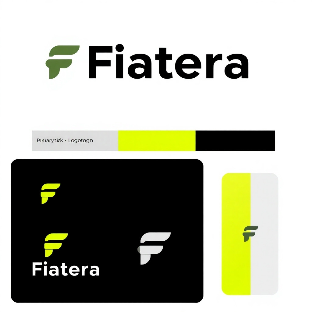
Create a set of high-quality logo concepts for a B2B fintech / crypto off-ramp payment service named "Fiatera". The brand is professional, technological, and international. Produce a clean, modern brandbook-style composition on a white background with three logo variations arranged horizontally or in a 2x2 grid: Primary (wordmark + mark), Logotype-only, and App icon (mark-only). Include small caption labels under each concept with the name of the variation ("Primary", "Logotype", "Mark / App Icon") and show the color palette swatches with hex codes: Carbon Black #0E0E10, Neon Lime #C7FF00, Silver Gray #E5E5E5, and an optional lime-to-white gradient swatch. Use the following design directions: 1) Overall style: - Minimalist, geometric, high-end fintech look; no ornate decorations. - Crisp vector-feel shapes, flat design (no heavy textures), subtle micro-shadows allowed for depth. - Balanced negative space and strict baseline alignment. - Use modern sans-serif letterforms reminiscent of Space Grotesk or Neue Haas Grotesk; kerning tight but readable. 2) Primary variation (wordmark + mark): - Mark should visually express "off-ramp" / "transition" / "bridge" / "exit". Consider: a diagonal off-ramp arrow formed by two parallel lines converging to a single arrowhead, or a minimalist arc/bridge integrated with negative space. - Wordmark "Fiatera" in all-lowercase or capitalized 'F' with clean geometric strokes. Integrate a subtle custom detail in one letter (for example: replace the middle bar of 'E' with three thin horizontal lines, or make the 'A' apex a small gap reminiscent of a gateway). - Color: wordmark in Carbon Black #0E0E10, mark accent in Neon Lime #C7FF00. 3) Logotype-only variation: - Stylized "Fiatera" wordmark without separate mark; emphasize one typographic modification that can serve as a brand hook (like a sliced 'A' or a trailing lime dot after the 'a' representing conversion). - Prefer horizontal layout suitable for headers. 4) Mark / App Icon: - Square-friendly, simple, highly legible at 16–64 px. - Avoid intricate inner details; prefer bold geometric strokes. Options: monogram 'F' formed by negative space that creates an off-ramp, or a compact symbol of pixels → line (dots morphing into a solid stroke). - Use Neon Lime #C7FF00 on Carbon Black #0E0E10 or white background variations. 5) Layout and presentation: - White background. Each logo variant should be placed in its own tile with a short descriptive caption (1–2 lines) under it describing the idea ("Off-ramp arrow — transition from crypto to fiat", etc.). - Include a small palette strip (three swatches with hex codes) at the bottom or side of the page and a sample line showing the optional gradient ("#C7FF00 → #FFFFFF"). - Provide versions in: full-color on white, inverted dark-bar mockup (dark strip showing inverted logo), and an isolated SVG-like flat version. 6) Visual tone and DOs / DON'Ts: - DO: clean geometry, high contrast, scalability, professional fintech appearance. - DO: emphasize clarity and legibility at small sizes. - DON'T: neon-glow effects, script or decorative fonts, generic crypto clichés (no skulls, coins with Bitcoin symbol, cartoon rockets). - DON'T: overly complex gradients or photorealistic textures. 7) Output specifics: - High-resolution PNG(s) and an SVG-style flat vector look. Center composition, generous whitespace. - Provide 3–6 distinct concept variations within the same image (each clearly labeled) so a designer can pick a direction. End result: a polished brandbook page showing 3 distinct, professional logo directions for "Fiatera" (Primary, Logotype, Mark), color swatches with hex codes, short captions, and a clean white background. Prioritize a B2B fintech aesthetic: strict, technological, and international.
Engine
BNX AI 1.0
Size
1:1
Created
21 October, 2025
Views
363
Downloads
4
Share
HTML Code
This is just one of the features of our unique system. Our model works very quickly and accurately. It uses advanced artificial intelligence and creates high-quality images.
ㅤBNX AI algorithms run on proprietary clusters built on NVIDIA GB300 NVL72 systems.
ㅤGeneration of images with any aspect ratio: 1:1, 2:3, 3:2, 4:5, 5:4, 4:3, 3:4, 16:9, 21:9, 9:16, 9:21
ㅤThere is nothing superfluous in our interface, only a prompt input field.
Our prices are on average 83% cheaper than those of large AI companies.
Even on the free plan, you can download generated images without restrictions.
Our own algorithm. Fast, modern. Almost perfect. Developed over 2 years.
Answers to frequently asked questions about working with the BNX AI 1.0 image generation system.
When generating an image, you can open the options and enable stealth mode, then the images will not be added to the public database and no one will see them; they will be private.
We trained the BNX AI 1.0 algorithm for over a year, and it is equally adept at generating various types of images: illustrations, architecture, portraits, super-realistic images, 3D models, logos, and much more. We managed to achieve very good results when working with text, so it is easy to create both a logo and a poster.
You may use the images at your discretion. Professional and Enterprise plan users may use the images for any commercial purposes. They may also sell these images. We ask Standard plan users to include a link to bnx.me when publishing images, but this is not a mandatory requirement.
