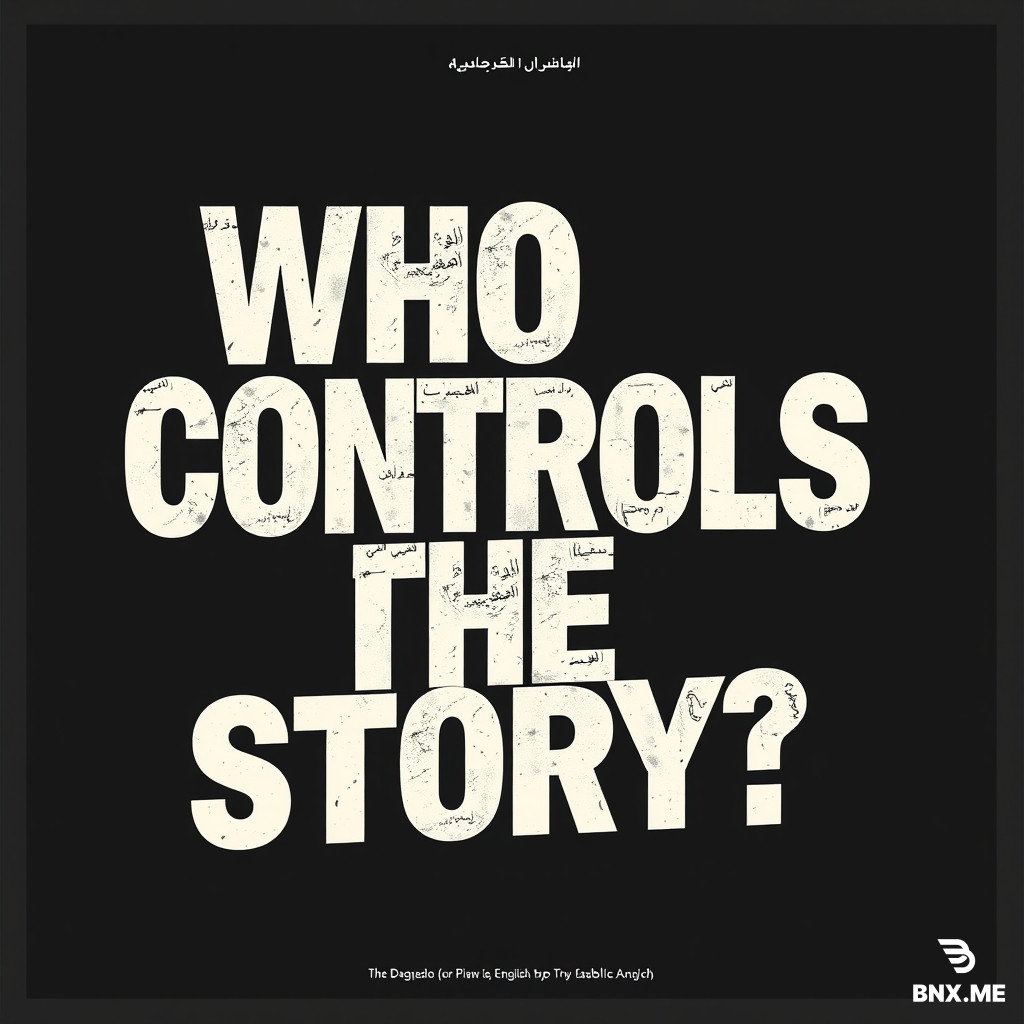

Prompt
Create an exceptionally creative, professional, experimental typography poster for my Graphic Design class. The concept is **“WHO CONTROLS THE STORY?”** exploring how powerful people, political elites, and media institutions can shape public perception, control narratives, and influence what people believe. **IMPORTANT: I want typography to be the main focus, NOT illustration or traditional graphic design.** My professor specifically wants to see strong typographic experimentation, originality, and excellent craftsmanship. Since I speak both Arabic and English, I want to use both languages as an essential part of the design, creating a powerful visual conversation between the two scripts. ### 1. TYPOGRAPHY — BE EXTREMELY CREATIVE Do not simply place an English headline at the top and its Arabic translation underneath. Experiment boldly with the actual letters and words. * Make some words extremely large, stretched, compressed, distorted, cropped, rotated, fragmented, or partially hidden. * Play with dramatic differences in scale, spacing, alignment, weight, and negative space. * Let Arabic calligraphy interact with English typography, overlap it, interrupt it, weave through it, or occupy unexpected spaces. * Experiment with Arabic letterforms, connected letter shapes, elongated strokes, ligatures, and the distinctive rhythm of Arabic script. * Make certain letters disappear behind other words, break apart, or extend beyond the edges of the poster. * Use unconventional compositions, asymmetrical layouts, unexpected line breaks, and surprising placements. * Create visual tension between order and chaos, readability and distortion, control and manipulation. * Make every word placement feel intentional and conceptually meaningful, not randomly decorative. ### 2. BILINGUAL CONCEPT Use the English headline: “WHO CONTROLS THE STORY?” Pair it with one of these Arabic phrases: “مَن يَروي القِصّة؟” or “مَن يَصنع الرِّواية؟” You may also experiment with individual words such as WHO, CONTROLS, STORY, مَن, يَروي, القِصّة, and الرِّواية as independent typographic elements. The Arabic should be visually powerful and clearly legible, not treated as a small subtitle or decorative symbol. Give the Arabic its own identity and allow it to compete with or challenge the English headline. ### 3. VISUAL DIRECTION Use my attached reference images as inspiration for the experimental typography, layered text, unusual compositions, overlapping type, and editorial poster aesthetics. Do NOT copy their layouts. Invent an original design that feels more sophisticated, unexpected, and memorable. Explore a combination of: * Bold condensed sans-serif typography. * Expressive Arabic calligraphy or custom-looking Arabic letterforms. * Extreme scale contrasts and unusual spacing. * Subtle paper grain, photocopy textures, distressed printing, or screen-print imperfections, if they enhance the typography. * Minimal lines, marks, or abstract shapes only when they strengthen the concept. A palette of black, warm off-white, and vivid red would work well, but feel free to explore a restrained alternative if it makes the design stronger. ### 4. CONCEPTUAL STORYTELLING Make the typography itself communicate the idea of control and manipulation. For example, one word might visually dominate another, letters might appear trapped, hidden, interrupted, or pulled apart, and the Arabic and English phrases might compete for visual authority. Avoid obvious stock illustrations of puppets, hands, television screens, politicians, or newspaper collages. I want the message to emerge primarily through typography, composition, and the relationship between the two languages. ### 5. DESIGN QUALITY The result should look like an award-winning experimental editorial typography poster created by a highly skilled graphic designer, not a generic AI-generated poster. Prioritize: * Originality and a strong visual concept. * Excellent typographic hierarchy. * Sophisticated composition and negative space. * Meaningful interaction between Arabic and English. * Beautifully handled Arabic letterforms. * Bold experimentation without losing the central message. * A visually striking result that would impress a university-level graphic design professor. Create a vertical poster composition suitable for a 18 × 24 inch print. **Final instruction:** Be genuinely experimental. Do not settle for a conventional headline-and-subtitle layout. Focus on manipulating the words themselves in unexpected ways. I want to look at the poster and immediately notice the typography, discover new details as I look closer, and feel that every typographic decision contributes to the meaning. The design should be ambitious, visually intelligent, and distinctly original.
Engine
BNX AI 1.0
Size
1:1
Created
11 October, 2026
Views
3
Downloads
0
Share
HTML Code
This is just one of the features of our unique system. Our model works very quickly and accurately. It uses advanced artificial intelligence and creates high-quality images.

ㅤBNX AI algorithms run on proprietary clusters built on NVIDIA GB300 NVL72 systems.

ㅤGeneration of images with any aspect ratio: 1:1, 2:3, 3:2, 4:5, 5:4, 4:3, 3:4, 16:9, 21:9, 9:16, 9:21

ㅤThere is nothing superfluous in our interface, only a prompt input field.

Our prices are on average 83% cheaper than those of large AI companies.

Even on the free plan, you can download generated images without restrictions.

Our own algorithm. Fast, modern. Almost perfect. Developed over 2 years.
Answers to frequently asked questions about working with the BNX AI 1.0 image generation system.
We are a young, technology-driven, growing startup. At the moment, we are not attracting funding from venture capital funds or business angels, so we would appreciate any support. You can sign up for the Enterprise plan, which will help us. 💙

When generating an image, you can open the options and enable stealth mode, then the images will not be added to the public database and no one will see them; they will be private.
We trained the BNX AI 1.0 algorithm for over a year, and it is equally adept at generating various types of images: illustrations, architecture, portraits, super-realistic images, 3D models, logos, and much more. We managed to achieve very good results when working with text, so it is easy to create both a logo and a poster.
You may use the images at your discretion. Professional and Enterprise plan users may use the images for any commercial purposes. They may also sell these images. We ask Standard plan users to include a link to bnx.me when publishing images, but this is not a mandatory requirement.